
OVERVIEW
As a Product Designer at Bigscoots, I've had the opportunity to work on the complete redesign of Bigscoots site hosting web application. In this case study, I will provide an in-depth exploration of the design process, unraveling the 'why' and 'how' behind the transformation of Bigscoots site hosting experience
ROLE
Product Designer
INDUSTRY
Information Technology (IT)
TEAM
4 Stakeholders
2 Product Manager
1 Technical Manager
3 Software Developers
1 Product Designer
CONTRIBUTION
Product Thinking, Competitive Analysis, User Interests, Interaction Design, Visual Design, Product Testing

ABOUT BIGSCOOTS
BigScoots is a web hosting company that provides services such as shared hosting, reseller hosting, virtual private servers (VPS), and dedicated servers. They offer hosting solutions for various types of websites, including personal blogs, business websites, and online stores. BigScoots is known for its focus on performance, reliability, and customer support.
WHO IS THE USER 👤
These users seek reliability, performance, and ease of use in their web hosting solutions. They expect a hosting platform that simplifies the often daunting task of managing their online presence, providing them with the tools and support necessary to build, maintain, and scale their websites effectively.
These users seek reliability, performance, and ease of use in their web hosting solutions. They expect a hosting platform that simplifies the often daunting task of managing their online presence, providing them with the tools and support necessary to build, maintain, and scale their websites effectively.
HOW I UNDERSTAND USER? 👀

To gain insights into user behavior and enhance the user experience, I leverage tools like LogRocket, which provide invaluable data on user interactions within the platform. LogRocket enables me to track user sessions, meticulously analyzing the flow through which users navigate to accomplish specific tasks.
By closely examining these sessions, I pinpoint areas where users encounter difficulties or frustrations, allowing me to identify pain points and areas for improvement. Additionally, LogRocket helps in determining the major sections of the platform where users tend to spend the most time.
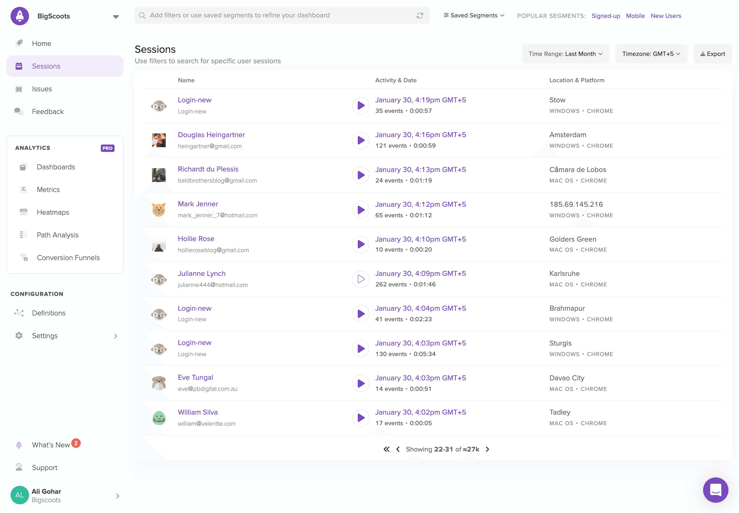

Through this data-driven approach, I gain a deeper understanding of user interactions and can make informed decisions to enhance the overall user experience on the BigScoots platform.
UNDERSTANDING THE PROBLEM SPACE 🧐
The BigScoots team previously worked with another designer, and upon my entry into the project, it became evident that there were numerous UI inconsistencies and UX challenges requiring urgent attention what we commonly refer to as "design and engineering debt". Initially, stakeholders aimed to rectify these issues within the existing systems.
However, a significant hurdle emerged – the designs had been previously handled by developers, and editable versions were nowhere to be found. Faced with this obstacle, the decision was made to embark on a complete revamp of the platform.
This debt manifested in various challenges, including user experience hurdles, and a lack of cohesive design language.

Discoverability:
Prominent features, such as adding new sites or migrating existing ones, suffered from low discoverability. Additionally, users struggled to find essential information within the site details section, hindered by unclear tabs and subtabs.
Lack of Visual Hierarchy:
Testing sessions highlighted user confusion regarding the platform's functionality. Many areas lacked visual and informational hierarchy, exacerbating user comprehension challenges and hindering task completion.
Scalability:
As the platform expanded its offerings, accommodating new features such as domain management and site migration, scalability became a pressing concern. The need for a comprehensive reconstruction to integrate these functionalities seamlessly into the platform's framework became evident.
REDESIGN GOALS 🎨
Make it simple, but significant
As a designer undertaking the redesign of BigScoots, my primary challenge lies in simplifying the wealth of information crucial for users managing their websites. The overarching goal is to streamline the website management process, ensuring accessibility for every user. Before diving into the visual design phase, I set forth a series of pivotal conditions aimed at shaping an efficient user experience, including:
It must be intuitive and transparent which allows the user to always know the next step to take.
The flow must reduce the number of clicks which in turn reduces the task time.
The new product must build trust between the user and the platform.
FINAL SHAPED DESIGN
#1. Login | Signup for Customer Portal
Enhance Experience & Optimise Speed
For the Customer portal's Login screens new design involved a complete overhaul of its structure. Recognizing the time-consuming nature of svgator animations in previous designs, I removed and replaced them to improve page loading speed. To facilitate effortless logins, I introduced social login options.


If you're eager to visualise the current login screen, I recommend visiting https://wpo.bigscoots.com
#2. Dashboard
More Defined Information & Analytics
Improved the visual aesthetics of the dashboard and sequence of amount of Information, as this is the very first page where user come after login into the platform

Furthermore, users encountered confusion regarding plans/services (what bigscoots was doing is; whenever the user purchases a plan and ad a domain in that plan, bigscoots named the plan of the first added domain which is primary and all other domain added later consider as add-on domains) which typically use domain name as a plan name. i changed the existing structure and create a difference between a plan and a domain
#3. Adding & Migrating Site
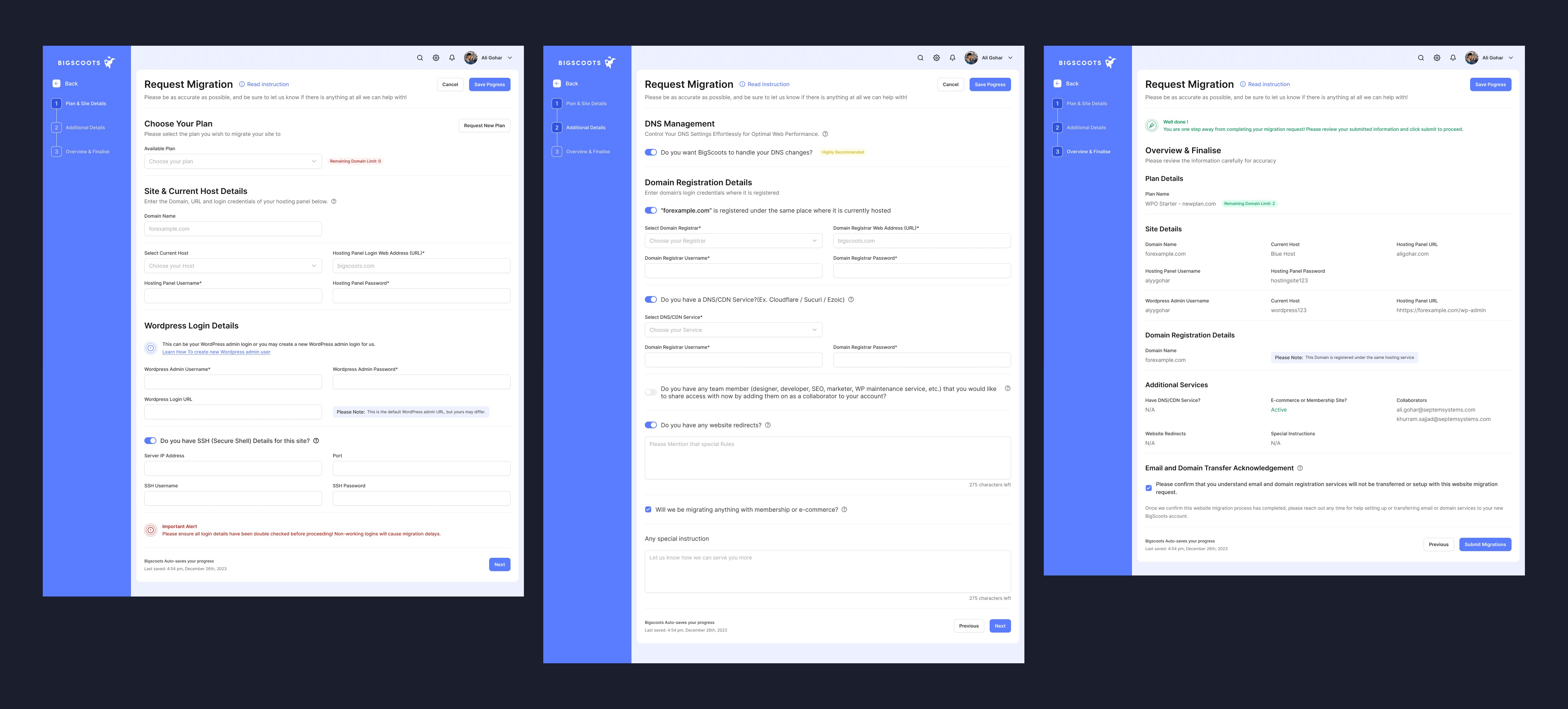
Decrease the steps & time to perform task
Adding a site in BigScoots posed complexity for newcomers, particularly concerning the intricacies of selecting a plan. Users would typically input all site details and proceed to choose a plan, only to discover later whether their current plan had any available limits. To address this issue, I overhauled the existing structure and streamlined the flow, reducing the number of steps involved. This redesign aimed to instill greater user trust and enhance the overall experience within the platform

In the site migration process from other platforms to BigScoots, I streamlined the six-step process into three steps. Users now simply fill in the required information, submit it, and then the BigScoots team verifies all provided details. If the information is accurate, our team migrates the site to our platform within 24 hours. This optimization aimed to simplify the migration process, reducing user effort and expediting the transition to BigScoots for a smoother and more efficient experience.
#4. Site Details
Improved User Navigation & Accessibility
Within the BigScoots platform, the Site Details screen serves as a pivotal hub for users to efficiently manage their websites. Recognising its significance, I implemented clear and concise informational tabs with sub-tabs to streamline user navigation and decision-making processes. By organising information in a structured manner, users can swiftly assess their options and anticipate the next steps, fostering a smoother and more intuitive user experience

In addition to enhancing accessibility and navigation, I integrated navigating tabs within the Site Details screen to facilitate effortless selection of plans, domains, and environments (live or staging). This thoughtful design not only elevates the screen's aesthetics but also enables users to seamlessly navigate between different sections, all from a single, visually appealing interface.

DESIGN LANGUAGE & CONSISTENCY 😎
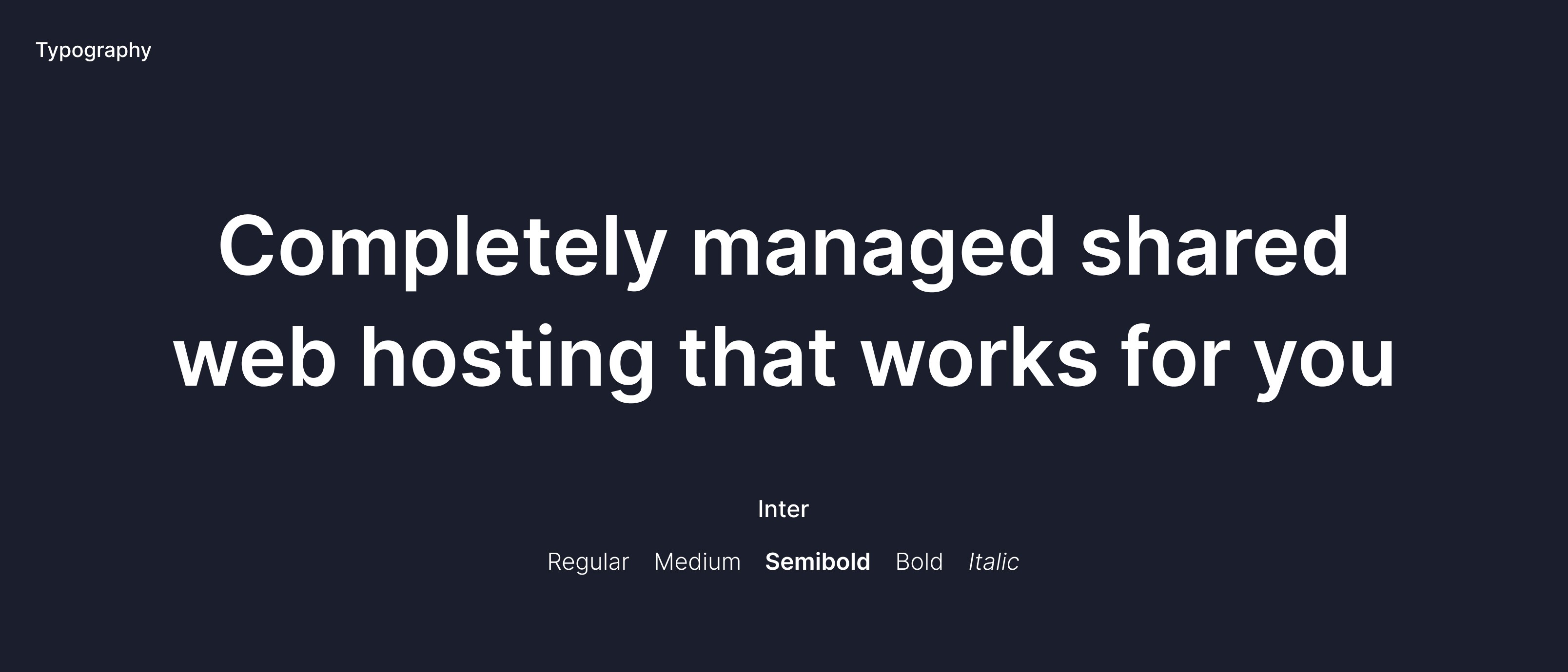
#1. Fresh coat of paint
A revised version of design systems with improved style of typeface and colours

#2. Custom Components

CHALLENGES & LEARNINGS 💡
Since I have no background in hosting services, it was quite challenging + Interesting to learn all about web hosting and how it worked.
It was interesting to understand the business needs and targets after connecting with the stakeholder.
Gaining a deep understanding of user needs and closely tracking their patterns provided valuable insights, enabling me to align our objectives effectively.
I understood that it is critical to be a team player in order to maintain active communication with diverse teams in order to obtain and comprehend data.
Adapt, implement design cues after feedback sessions and keep testing to best understand your users.
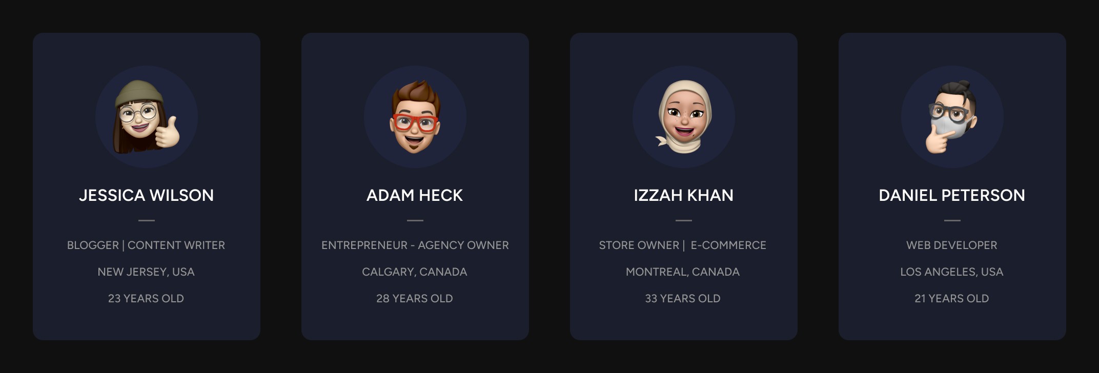
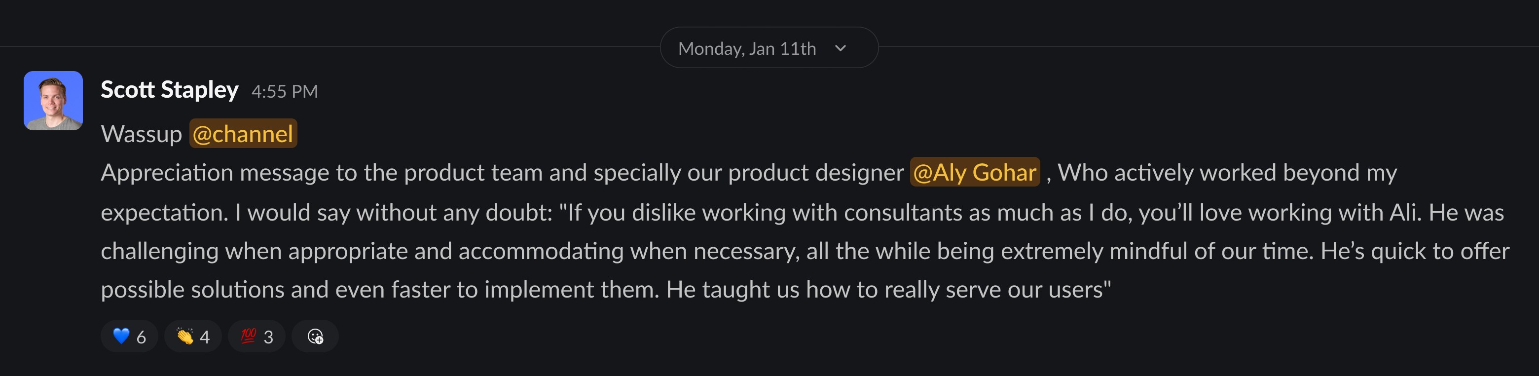
WHAT THEY SAY ABOUT ME


OVERVIEW
As a Product Designer at Bigscoots, I've had the opportunity to work on the complete redesign of Bigscoots site hosting web application. In this case study, I will provide an in-depth exploration of the design process, unraveling the 'why' and 'how' behind the transformation of Bigscoots site hosting experience
ROLE
Product Designer
INDUSTRY
Information Technology (IT)
TEAM
4 Stakeholders
2 Product Manager
1 Technical Manager
3 Software Developers
1 Product Designer
CONTRIBUTION
Product Thinking, Competitive Analysis, User Interests, Interaction Design, Visual Design, Product Testing
ABOUT BIGSCOOTS
BigScoots is a web hosting company that provides services such as shared hosting, reseller hosting, virtual private servers (VPS), and dedicated servers. They offer hosting solutions for various types of websites, including personal blogs, business websites, and online stores. BigScoots is known for its focus on performance, reliability, and customer support.
WHO IS THE USER 👤
These users seek reliability, performance, and ease of use in their web hosting solutions. They expect a hosting platform that simplifies the often daunting task of managing their online presence, providing them with the tools and support necessary to build, maintain, and scale their websites effectively.
These users seek reliability, performance, and ease of use in their web hosting solutions. They expect a hosting platform that simplifies the often daunting task of managing their online presence, providing them with the tools and support necessary to build, maintain, and scale their websites effectively.
HOW I UNDERSTAND USER? 👀
To gain insights into user behavior and enhance the user experience, I leverage tools like LogRocket, which provide invaluable data on user interactions within the platform. LogRocket enables me to track user sessions, meticulously analyzing the flow through which users navigate to accomplish specific tasks.
By closely examining these sessions, I pinpoint areas where users encounter difficulties or frustrations, allowing me to identify pain points and areas for improvement. Additionally, LogRocket helps in determining the major sections of the platform where users tend to spend the most time.
Through this data-driven approach, I gain a deeper understanding of user interactions and can make informed decisions to enhance the overall user experience on the BigScoots platform.
UNDERSTANDING THE PROBLEM SPACE 🧐
The BigScoots team previously worked with another designer, and upon my entry into the project, it became evident that there were numerous UI inconsistencies and UX challenges requiring urgent attention what we commonly refer to as "design and engineering debt". Initially, stakeholders aimed to rectify these issues within the existing systems.
However, a significant hurdle emerged – the designs had been previously handled by developers, and editable versions were nowhere to be found. Faced with this obstacle, the decision was made to embark on a complete revamp of the platform.
This debt manifested in various challenges, including user experience hurdles, and a lack of cohesive design language.
Discoverability:
Prominent features, such as adding new sites or migrating existing ones, suffered from low discoverability. Additionally, users struggled to find essential information within the site details section, hindered by unclear tabs and subtabs.
Lack of Visual Hierarchy:
Testing sessions highlighted user confusion regarding the platform's functionality. Many areas lacked visual and informational hierarchy, exacerbating user comprehension challenges and hindering task completion.
Scalability:
As the platform expanded its offerings, accommodating new features such as domain management and site migration, scalability became a pressing concern. The need for a comprehensive reconstruction to integrate these functionalities seamlessly into the platform's framework became evident.
REDESIGN GOALS 🎨
Make it simple, but significant
As a designer undertaking the redesign of BigScoots, my primary challenge lies in simplifying the wealth of information crucial for users managing their websites. The overarching goal is to streamline the website management process, ensuring accessibility for every user. Before diving into the visual design phase, I set forth a series of pivotal conditions aimed at shaping an efficient user experience, including:
It must be intuitive and transparent which allows the user to always know the next step to take.
The flow must reduce the number of clicks which in turn reduces the task time.
The new product must build trust between the user and the platform.
FINAL SHAPED DESIGN
#1. Login | Signup for Customer Portal
Enhance Experience & Optimise Speed
For the Customer portal's Login screens new design involved a complete overhaul of its structure. Recognizing the time-consuming nature of svgator animations in previous designs, I removed and replaced them to improve page loading speed. To facilitate effortless logins, I introduced social login options.
If you're eager to visualise the current login screen, I recommend visiting https://wpo.bigscoots.com
#2. Dashboard
More Defined Information & Analytics
Improved the visual aesthetics of the dashboard and sequence of amount of Information, as this is the very first page where user come after login into the platform
Furthermore, users encountered confusion regarding plans/services (what bigscoots was doing is; whenever the user purchases a plan and ad a domain in that plan, bigscoots named the plan of the first added domain which is primary and all other domain added later consider as add-on domains) which typically use domain name as a plan name. i changed the existing structure and create a difference between a plan and a domain
#3. Adding & Migrating Site
Decrease the steps & time to perform task
Adding a site in BigScoots posed complexity for newcomers, particularly concerning the intricacies of selecting a plan. Users would typically input all site details and proceed to choose a plan, only to discover later whether their current plan had any available limits. To address this issue, I overhauled the existing structure and streamlined the flow, reducing the number of steps involved. This redesign aimed to instill greater user trust and enhance the overall experience within the platform
In the site migration process from other platforms to BigScoots, I streamlined the six-step process into three steps. Users now simply fill in the required information, submit it, and then the BigScoots team verifies all provided details. If the information is accurate, our team migrates the site to our platform within 24 hours. This optimization aimed to simplify the migration process, reducing user effort and expediting the transition to BigScoots for a smoother and more efficient experience.
#4. Site Details
Improved User Navigation & Accessibility
Within the BigScoots platform, the Site Details screen serves as a pivotal hub for users to efficiently manage their websites. Recognising its significance, I implemented clear and concise informational tabs with sub-tabs to streamline user navigation and decision-making processes. By organising information in a structured manner, users can swiftly assess their options and anticipate the next steps, fostering a smoother and more intuitive user experience
In addition to enhancing accessibility and navigation, I integrated navigating tabs within the Site Details screen to facilitate effortless selection of plans, domains, and environments (live or staging). This thoughtful design not only elevates the screen's aesthetics but also enables users to seamlessly navigate between different sections, all from a single, visually appealing interface.
DESIGN LANGUAGE & CONSISTENCY 😎
#1. Fresh coat of paint
A revised version of design systems with improved style of typeface and colours
#2. Custom Components
CHALLENGES & LEARNINGS 💡
Since I have no background in hosting services, it was quite challenging + Interesting to learn all about web hosting and how it worked.
It was interesting to understand the business needs and targets after connecting with the stakeholder.
Gaining a deep understanding of user needs and closely tracking their patterns provided valuable insights, enabling me to align our objectives effectively.
I understood that it is critical to be a team player in order to maintain active communication with diverse teams in order to obtain and comprehend data.
Adapt, implement design cues after feedback sessions and keep testing to best understand your users.
WHAT THEY SAY ABOUT ME
OVERVIEW
As a Product Designer at Bigscoots, I've had the opportunity to work on the complete redesign of Bigscoots site hosting web application. In this case study, I will provide an in-depth exploration of the design process, unraveling the 'why' and 'how' behind the transformation of Bigscoots site hosting experience
ROLE
Product Designer
INDUSTRY
Information Technology (IT)
TEAM
4 Stakeholders
2 Product Manager
1 Technical Manager
3 Software Developers
1 Product Designer
CONTRIBUTION
Product Thinking, Competitive Analysis, User Interests, Interaction Design, Visual Design, Product Testing
ABOUT BIGSCOOTS
BigScoots is a web hosting company that provides services such as shared hosting, reseller hosting, virtual private servers (VPS), and dedicated servers. They offer hosting solutions for various types of websites, including personal blogs, business websites, and online stores. BigScoots is known for its focus on performance, reliability, and customer support.
WHO IS THE USER 👤
These users seek reliability, performance, and ease of use in their web hosting solutions. They expect a hosting platform that simplifies the often daunting task of managing their online presence, providing them with the tools and support necessary to build, maintain, and scale their websites effectively.
These users seek reliability, performance, and ease of use in their web hosting solutions. They expect a hosting platform that simplifies the often daunting task of managing their online presence, providing them with the tools and support necessary to build, maintain, and scale their websites effectively.
HOW I UNDERSTAND USER? 👀
To gain insights into user behavior and enhance the user experience, I leverage tools like LogRocket, which provide invaluable data on user interactions within the platform. LogRocket enables me to track user sessions, meticulously analyzing the flow through which users navigate to accomplish specific tasks.
By closely examining these sessions, I pinpoint areas where users encounter difficulties or frustrations, allowing me to identify pain points and areas for improvement. Additionally, LogRocket helps in determining the major sections of the platform where users tend to spend the most time.
Through this data-driven approach, I gain a deeper understanding of user interactions and can make informed decisions to enhance the overall user experience on the BigScoots platform.
UNDERSTANDING THE PROBLEM SPACE 🧐
The BigScoots team previously worked with another designer, and upon my entry into the project, it became evident that there were numerous UI inconsistencies and UX challenges requiring urgent attention what we commonly refer to as "design and engineering debt". Initially, stakeholders aimed to rectify these issues within the existing systems.
However, a significant hurdle emerged – the designs had been previously handled by developers, and editable versions were nowhere to be found. Faced with this obstacle, the decision was made to embark on a complete revamp of the platform.
This debt manifested in various challenges, including user experience hurdles, and a lack of cohesive design language.
Discoverability:
Prominent features, such as adding new sites or migrating existing ones, suffered from low discoverability. Additionally, users struggled to find essential information within the site details section, hindered by unclear tabs and subtabs.
Lack of Visual Hierarchy:
Testing sessions highlighted user confusion regarding the platform's functionality. Many areas lacked visual and informational hierarchy, exacerbating user comprehension challenges and hindering task completion.
Scalability:
As the platform expanded its offerings, accommodating new features such as domain management and site migration, scalability became a pressing concern. The need for a comprehensive reconstruction to integrate these functionalities seamlessly into the platform's framework became evident.
REDESIGN GOALS 🎨
Make it simple, but significant
As a designer undertaking the redesign of BigScoots, my primary challenge lies in simplifying the wealth of information crucial for users managing their websites. The overarching goal is to streamline the website management process, ensuring accessibility for every user. Before diving into the visual design phase, I set forth a series of pivotal conditions aimed at shaping an efficient user experience, including:
It must be intuitive and transparent which allows the user to always know the next step to take.
The flow must reduce the number of clicks which in turn reduces the task time.
The new product must build trust between the user and the platform.
FINAL SHAPED DESIGN
#1. Login | Signup for Customer Portal
Enhance Experience & Optimise Speed
For the Customer portal's Login screens new design involved a complete overhaul of its structure. Recognizing the time-consuming nature of svgator animations in previous designs, I removed and replaced them to improve page loading speed. To facilitate effortless logins, I introduced social login options.
If you're eager to visualise the current login screen, I recommend visiting https://wpo.bigscoots.com
#2. Dashboard
More Defined Information & Analytics
Improved the visual aesthetics of the dashboard and sequence of amount of Information, as this is the very first page where user come after login into the platform
Furthermore, users encountered confusion regarding plans/services (what bigscoots was doing is; whenever the user purchases a plan and ad a domain in that plan, bigscoots named the plan of the first added domain which is primary and all other domain added later consider as add-on domains) which typically use domain name as a plan name. i changed the existing structure and create a difference between a plan and a domain
#3. Adding & Migrating Site
Decrease the steps & time to perform task
Adding a site in BigScoots posed complexity for newcomers, particularly concerning the intricacies of selecting a plan. Users would typically input all site details and proceed to choose a plan, only to discover later whether their current plan had any available limits. To address this issue, I overhauled the existing structure and streamlined the flow, reducing the number of steps involved. This redesign aimed to instill greater user trust and enhance the overall experience within the platform
In the site migration process from other platforms to BigScoots, I streamlined the six-step process into three steps. Users now simply fill in the required information, submit it, and then the BigScoots team verifies all provided details. If the information is accurate, our team migrates the site to our platform within 24 hours. This optimization aimed to simplify the migration process, reducing user effort and expediting the transition to BigScoots for a smoother and more efficient experience.
#4. Site Details
Improved User Navigation & Accessibility
Within the BigScoots platform, the Site Details screen serves as a pivotal hub for users to efficiently manage their websites. Recognising its significance, I implemented clear and concise informational tabs with sub-tabs to streamline user navigation and decision-making processes. By organising information in a structured manner, users can swiftly assess their options and anticipate the next steps, fostering a smoother and more intuitive user experience
In addition to enhancing accessibility and navigation, I integrated navigating tabs within the Site Details screen to facilitate effortless selection of plans, domains, and environments (live or staging). This thoughtful design not only elevates the screen's aesthetics but also enables users to seamlessly navigate between different sections, all from a single, visually appealing interface.
DESIGN LANGUAGE & CONSISTENCY 😎
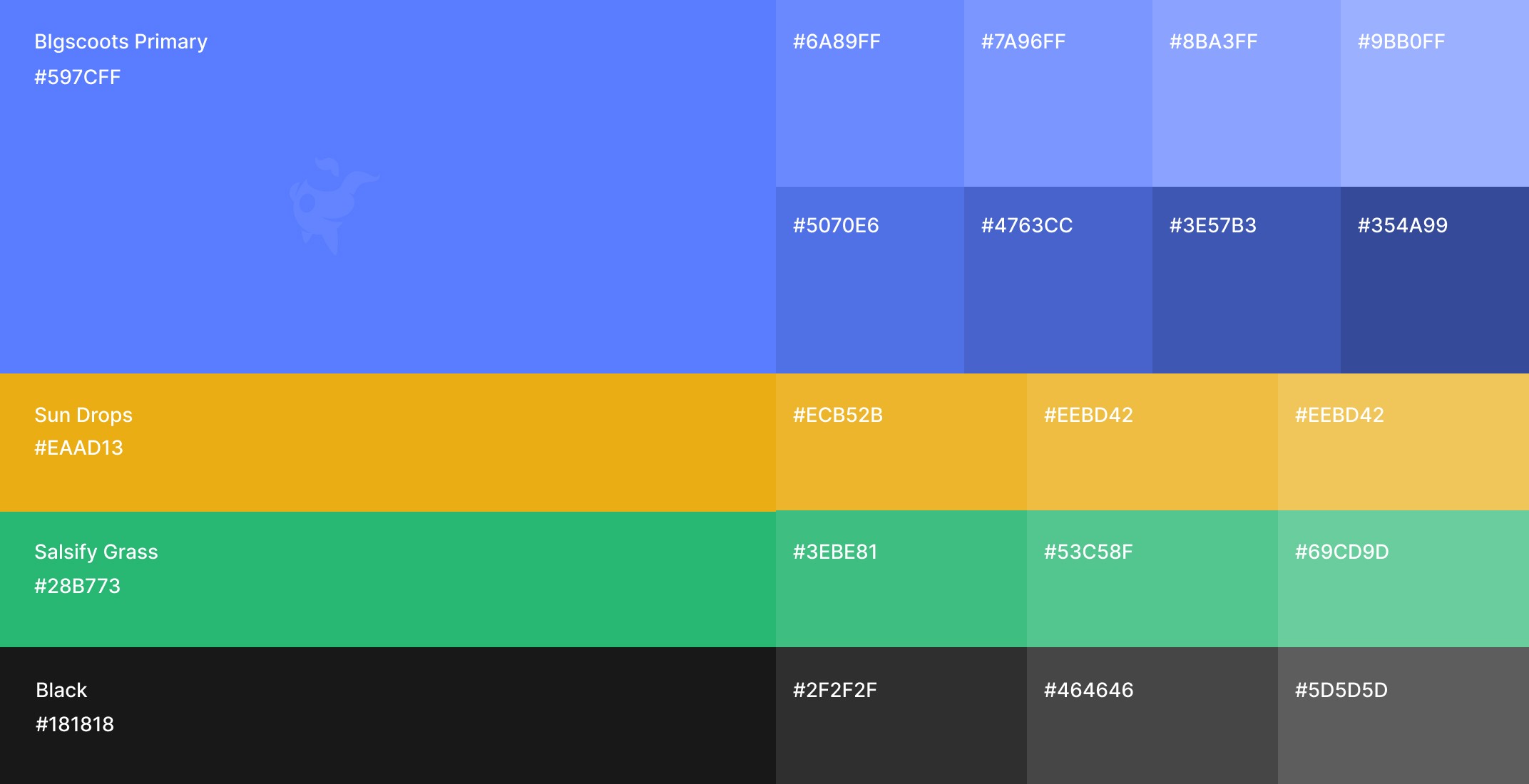
#1. Fresh coat of paint
A revised version of design systems with improved style of typeface and colours
#2. Custom Components
CHALLENGES & LEARNINGS 💡
Since I have no background in hosting services, it was quite challenging + Interesting to learn all about web hosting and how it worked.
It was interesting to understand the business needs and targets after connecting with the stakeholder.
Gaining a deep understanding of user needs and closely tracking their patterns provided valuable insights, enabling me to align our objectives effectively.
I understood that it is critical to be a team player in order to maintain active communication with diverse teams in order to obtain and comprehend data.
Adapt, implement design cues after feedback sessions and keep testing to best understand your users.
WHAT THEY SAY ABOUT ME